Angel Water Inc.
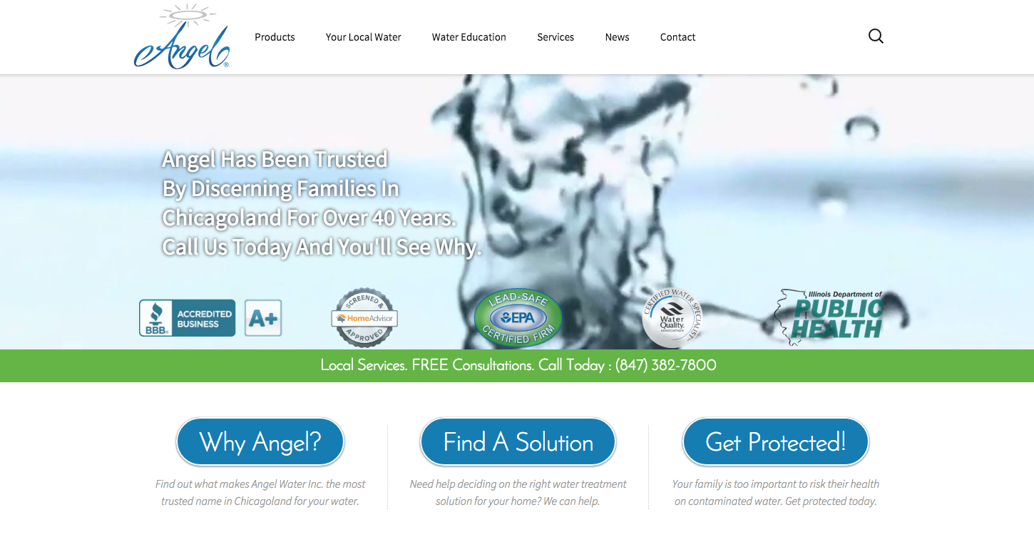
The New Angel Water Site is Converting Like Crazy!
But things didn’t always look this good. . .
 Last year Angel Water Inc. was having a bit of a web technology problem. They had a website, but they were relying on a developer to make updates. They were paying for SEO and getting traffic, but they weren’t getting any leads. After seeing my success with Evolve’s online marketing, they decided to give me a call and see what I could do for them.
I see this kind of thing all the time! A great company with passionate people working to deliver amazing service to their customers but there just seems to be something missing on the online marketing side. In this case, it was the website. The design wasn’t bad from an aesthetic point of view. It had good use of whitespace and well crafted images. The text was a little small and overall it was a little dated, but it was already several years old when they brought me in.
No, it wasn’t the look of the site that was the problem (though we brought that up to speed as well) it was the fact that the site was not designed to convert traffic into leads.
Angel was doing content marketing and driving traffic with Google AdWords, but when the traffic got to the site there wasn’t a well defined path for the visitor to follow. The site wasn’t engaging, and beyond that, there was no specific conversion based purpose to the design.
There are too many designers who envision a website as a digital business suit for a company. . . There are also many people (and many business owners specifically) who think that a “digital business suit” sounds like a pretty reasonable analogy, but it’s not quite right. A business suit just looks good. It doesn’t do anything special on it’s own.
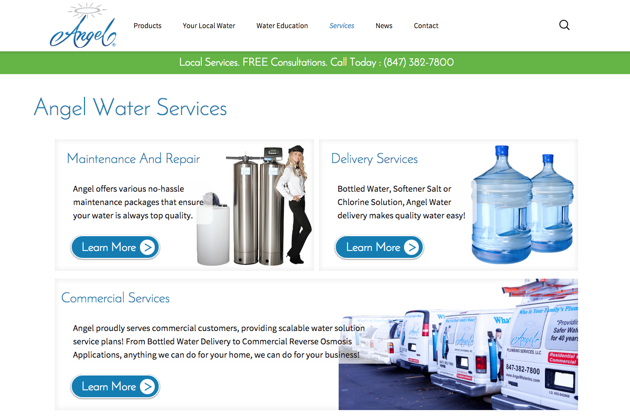
Arise Advertising Arts rebuilt the Angel Water Website as a luxury car instead. The underlying purpose of a luxury car is not appearance but function. The new Angel Water website is designed with lead generation in mind from the start. And that focus on function is revisited through every step of the project so that visitors are engaged and encouraged to make contact.
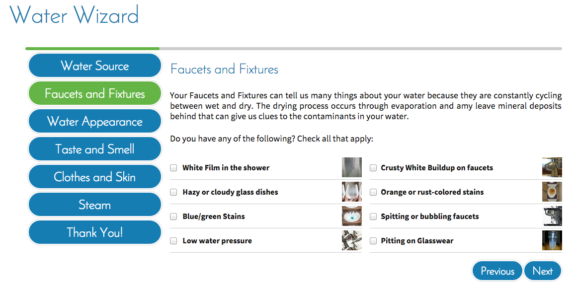
We started with multi-part contact forms that put the customer first. Then I created a custom water analysis application to assess a visitor’s water quality using tricks that water professionals would use in the field. This application is now generating highly qualified leads and sending a user generated water quality inspection to the sales reps at the company.
I built everything on the site, from the navigation to the links and even a call to action banner that stays at the top of the screen with a clickable phone number for mobile or desktop users.
Now conversions are up 50% and business is booming at Angel!
Looking pretty is just one of the perks of doing business with Arise. . .
Evolve 4 Peace
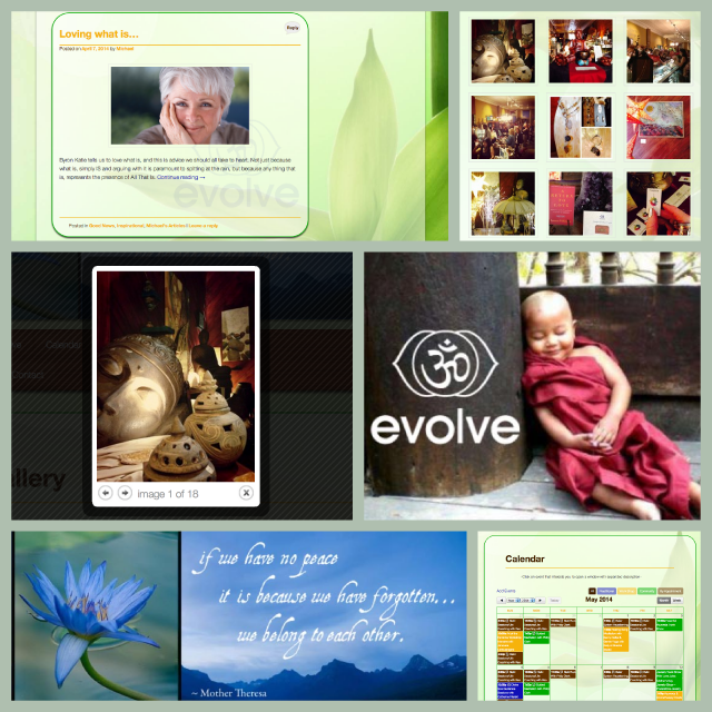 Lively and invigorating yet sophisticated and subtle, Evolve’s website is one of my earlier designs that has stood the test of time.
Utilizing vibrant colors, crisp lines and layered transparencies, Crystal Lake’s premiere wellness boutique shines with the same warmth online as it does downtown.
The combination of original graphics and amazing photography make evolve4peace.com a pleasure to visit.
With it’s customized event calendar, facebook integration, email collection form and blog, this website is a powerful marketing tool that is helping Evolve to effectively leverage it’s genuine warmth and personality!
If you are familiar with the Downtown Crystal Lake District then you know that Evolve has been instrumental in reinvigorating the Local economy and Arise Advertising Arts is very proud to be a part of their success!
Juice Feasting Green Room
 Working with David Rainoshek (the original creator of Juice Feasting™ who started the juice cleansing trend about ten years ago), has truly been a blessing!
Recently I helped David re-launch his private online community for juice feasters and cleansing aficionados, the Juice Feasting Green Room.
This is a bold responsive design that displays nicely on standard computers and laptops as well as most mobile devices.
The unique combination of bold graphics and ample whitespace gives this design a polished look that feels deep and solid yet paradoxically, very light and spacious.
Strong original artwork coupled with customized page templates and section specific headers make this sales site a powerful seller for David’s Juice Feasting™ programs.
Wilson's Fencing
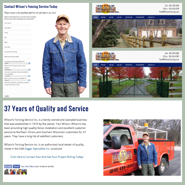 Wilson’s Fencing is a traditional family business with almost 4 decades of service in the Northern Illinois region, but just because Paul’s been around the block a few times, doesn’t mean he’s old fashioned.
As with any good website for a small family run business, WilsonsFencing.com finds power in the personality of the owner.
Paul Wilson’s brand new website feels like integrity. With traditional lines, conservative colors and ordered spacing this site speaks to the craftsmanship and attention to detail that Paul’s clients have recognized for over 35 years.
With a crisp professional feel, this site is more than just a pleasure to look at, it’s also designed specifically to generate contacts and leads with every page funneling traffic to the friendly custom contact form.
Paul got his first new Contact from his site while it was still in production!
