 Consistent marketing message
Most people don’t realize that the first step to creating a website that converts traffic into new leads and clients is clear and consistent communication across all media channels!
Imagine you have a pet store that set’s itself apart with “awesome stuff”. A natural tagline on the website is something like “Awesome stuff for your furry friends!” and it has an upbeat and playful look and feel.
However, the facebook page is all about “natural stuff”. Organic pet food and pet health is the message here, which is arguably “awesome” but the awesomeness is implicit rather than explicit.
This disconnect can be enough to make a visitor question if they are in the right place, or worse, it may make them think you are trying to trick them. If your visitor is into the idea of “awesome stuff”, then “heathly natural stuff” might make them think you are trying to sell them “expensive stuff”.
 On the other hand, a facebook following that is tracking well with the “natural stuff” might show up at your website and think the “awesome stuff” is really just a way of getting people excited about “cheap junk” so they question the quality of your “natural stuff” too.
This kind of mixed messaging can happen very easily, especially for small businesses which often share the social media responsibilities loosely among employees because different people will bring a different tone to social media.
It can also come about through a change in your brand. Through social media your business may grow into a different niche than you initially intended, and suddenly your website is not really consistent with your new market’s expectations.
To get back on track in a situation where the company has actually moved into a different niche might require rebranding, which is a lot of work and I am happy to help with it on an individual basis, but we don’t have time to cover it in detail here. However, less fundamental issues like the off-message “natural stuff” facebook page can be rectified by simply bringing the stray media channel back into the fold with an intentional migration to on-message “awesome stuff” content.
Website Conversion funnel


Your website should be like a catcher’s mitt for your traffic, not like a brick wall with an advertisement plastered across it. If you have a Pay Per Click ad campaign running on the search term dog grooming, but clicking the ad drops people on the homepage of your pet supply store which has Grooming Services hidden in a drop-down menu, you are shooting yourself in the foot.
Whether you are cultivating traffic from social media, paid advertising or even organic search, it is important for your website to present your visitors with a clear path to conversion, regardless of the reason they are on your site to begin with.
This means taking serious stock of your customers and your website visitors to really understand what they need AND what they want. It’s also important to understand that those are two very different things that each need to be handled appropriately in your website design.
For example a visitor who wants their dog to be happy and energetic may not understand how to make that happen. You have to educate them about what they need before they will purchase anything. This means addressing the want on the homepage with a link like “Keep your dog happy and youthful!” Which takes them to a page that explains what they need to make that happen (your product or service).
A solid understanding of the way human psychology interacts with web design is helpful here, but you don’t have to be a PhD to improve your conversions. You can get decent results if you simply work to anticipate your visitors wants and direct them to what they need in order to satisfy that desire.
Strong Call to Action
You can’t expect people to contact you or buy your product or really do anything at all if you don’t at least ask them to. If you want people to sign up for your newsletter, you need to say “Sign up for our newsletter!” and it needs to be visible.
I saw a newsletter signup form stuck in the footer of a website the other day and it made me laugh. I thought to myself, “These people probably don’t even have a newsletter, if they care that little about getting people signed up for it.”
Not that a CTA near the bottom of your content is a bad thing, in fact, if your content is well written, that is often where people are most ready to act anyway. But hidden in the footer with a small grey button that says “submit” is not the way to get people signed up.

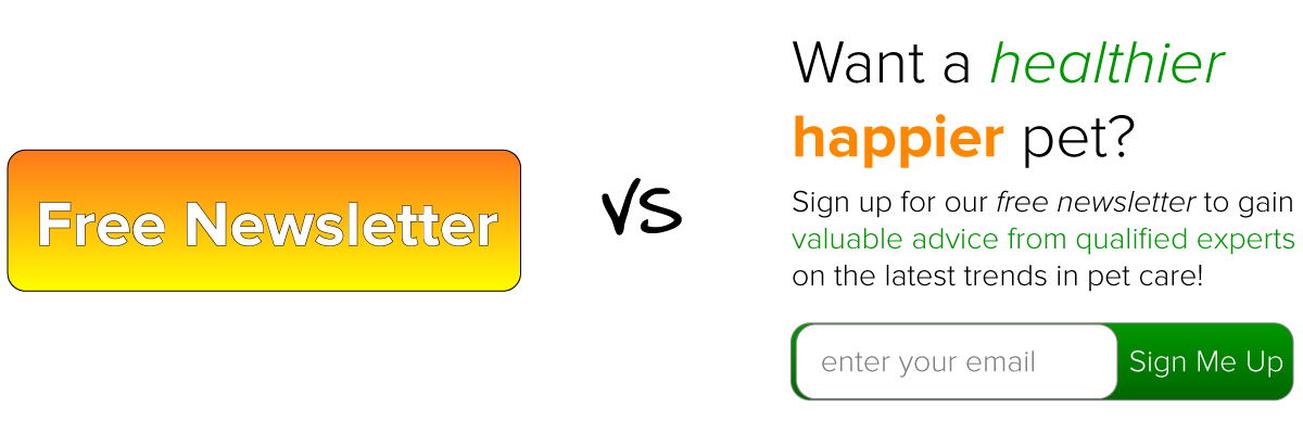
It’s also important to understand that a Call to Action is not just a fancy term for a button or a link. Your CTA could be a very big button that says, “Get our Newsletter” but it probably won’t perform as well as a smaller button under a quality offering.
How about bright, visible text that says “Would you like a healthier, happier pet? Sign up for our free newsletter and gain valuable advice from qualified experts on the latest trends in pet care!” and then a small “sign up” button?
A strong Call to Action starts with what the customer wants and then tells them what to do to achieve that desire.
Good follow up
It should go without saying but, your website isn’t converting well if YOU are not converting well. If you promise people a newsletter but you never send anything out, what kind of message does that send about your follow through as a business?
When someone contacts you through the website, whether it is an email sign up or a free download or a purchase or just a simple contact form submission, they should always get an automated reply that thanks them for their interest and tells them what will happen next.
If you leave people hanging, they will find another solution as quickly as google can google it up for them, so make sure your visitors, clients and customers always know what they can expect next, and when they should expect it.
This is a link to an excellent free guide from Ontraport, one of the masters in the contact management industry, on how you can make your digital follow up process much easier. If you are serious about tracking your leads and increasing your conversion rates, you’ll definitely want to check this out,
Of course it is not enough to just tell them, you then have to actually follow through with what you are saying. Don’t tell people, “Each week you will receive an electronic newsletter with expert insights, community events and great deals!” if what you really mean is, “I’ll send you coupons and advertisements every week.”
Of course you are going to send some ads and promotions, but if you are promising a newsletter, you can’t just leave out the “expert insight”.
Attractive and Professional Web Design
Of course the appearance of your site is important, in fact this is really important, but it’s also often over rated. Appearance isn’t going to do it all by itself, but if your business looks like the online equivalent of a lemonade stand run by 2nd graders, you are probably not doing yourself any favors. . . (Unless, of course, you are actually a second grader with a lemonade stand. In that case I’m extremely impressed that you have a website and are learning to leverage the power of the internet for business. Good Job!)
But for the rest of you out there; for the lawyers and doctors and contractors and professionals of all stripes, it is important that your website visually represent your commitment to quality.
I know that your website has no bearing on your ability to perform your service or provide your product. Why should we expect a terrific painter to have a website at all let alone a beautiful one?
But the truth is that people still believe that old adage, “How you do anything, is how you do Everything”.
Having said that, if you’re not a web designer or an online marketer, but you think it would be nice if your business had a website that converts anyway. . . Contact Me and let’s schedule a free consultation so that we can find ways to make the web work for you.